I had the pleasure of editing Carie Fisher, the author of web.dev’s latest course, Learn Accessibility. Learn Accessibility gives web developers the essentials for building accessible websites and web apps.
To promote this new content, I interviewed folks who work to build an accessible web.
Melanie Sumner told me about her journey from spy to engineer, accessible design, Ember.js, and the importance of funding these efforts.
Olutimilehin Olushuyi told me about his move from the law to web development, building accessible community, and creating accessible layouts.
Elisa Bandy told me about her work for Google’s internal teams, developing accessibility best practices for the web. Her blog post has yet to be published, but look for it in mid-December.
It’s an honor to work on Google Chrome’s developer relations team. I have the opportunity to speak with experts and offer a platform with a huge audience.
We highlighted additional resources as a part of ChromiumDev’s Accessibility Week.
Over the last three months, I’ve written a series of four blog posts about creating and managing instances with Packer and Terraform. It’s been a tremendous learning experience, and I couldn’t have done it without the help of some HashiCorp experts (and ex-pats). Thanks to Sean Chittenden, Paul Stack, and Justin Reagor for your advice, critique, and editing.
Below I’ve included excerpts from all of the posts. The source code for all of the exercises is available on GitHub.
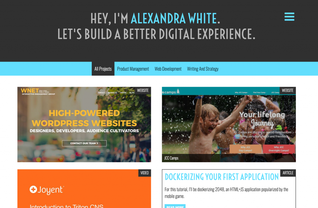
Every two years I redesign my website. It’s an opportunity to be up on modern web design trends, find gaps in content, and re-position the way I think about my skill set. It’s also a way to make sure I still know what my theme looks like inside and out, so that if I do encounter any problems, I know how to fix them.
For this redesign, I decided I wanted to accomplish the following:
Create a way to sort through projects by skill (web development, writing and strategy, product management, video, etc);
Create a case study style for projects to better highlight the purposes as well as additional deliverables;
Remove the resume as featured content, leaving that to LinkedIn;
Make it easier to contact me;
Simplify the design.
This site is one of the most important selling points for why you’d want to work with me. I want to make it easy to navigate, while being completely and utterly me.
I’ve learned a lot since I started working at IEG in August 2014, from building better WordPress themes via MVC to the ins-and-outs of git (how I got by before, I’ll never know). The greatest tool that I’ve embraced in my tenure is Sass. For those unfamiliar, Sass is a CSS preprocessor which takes giant complex stylesheets and neatly organizes them into tiers. There are so many features which will make your development process cleaner, faster, and happier.
Responsive web design is a buzz word that we are very familiar with at IEG. All of our modern sites fit that bill (we do have some that are quite old), and you can see it in action with the resize of your browser. The excess design falls away, the menu becomes a hamburger (which, has its own problems), sidebars slink below the content. But just because it fits a certain width parameter, doesn’t mean it works for mobile.
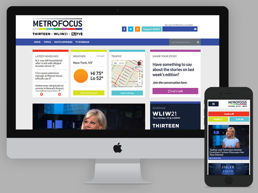
I just finished rebuilding the site for MetroFocus, a multi-platform news program focusing on the New York region. I got to a point where I was happy with the design, with the responsiveness, and we sent the site to our app developer to do some testing. He came back with incredibly insightful feedback when it came to thinking about actually using the site on a mobile device. The header and menu took up too much precious real estate and disappeared from view on scroll. The hamburger was small and surrounded by un-clickable (or, un-touchable) white space.
While the site looked good on a narrow browser, it wasn’t user-friendly for smartphones. I took his notes and spent a long time on my smartphone, clicking through and trying to think beyond “does this look good” and “is it broken” to thinking about the user’s experience on their phone. I can’t be spot on for every device and every situation, but we came to a place that is 100% better across the board.
This post was originally written and published on the IEG technical blog.
Often when we create our WordPress themes, they come with a small theme options page built using the Settings API. This page could have inputs for everything from social media handles to uploading a new logo or picking a homepage layout. Having these options makes it easier for non-developers to make important changes to their websites, or give it minor refreshment.
Here’s a pretty straightforward example of how we use it on Chasing the Dream. Administrators can update the links for social media icons, enter the unique Google Custom Search Key, pick a homepage grid, and even update the footer text.
Having a theme options page is a good way to set global options, such as a font or accent color. Instead of having to find all of the places within the CSS every time a client wants to try a different shade of blue, instead they can have the power to update it themselves.