October 26, 2015 Web Development
Responsive Design ≠ Mobile-Friendly
Responsive web design is a buzz word that we are very familiar with at IEG. All of our modern sites fit that bill (we do have some that are quite old), and you can see it in action with the resize of your browser. The excess design falls away, the menu becomes a hamburger (which, has its own problems), sidebars slink below the content. But just because it fits a certain width parameter, doesn’t mean it works for mobile.
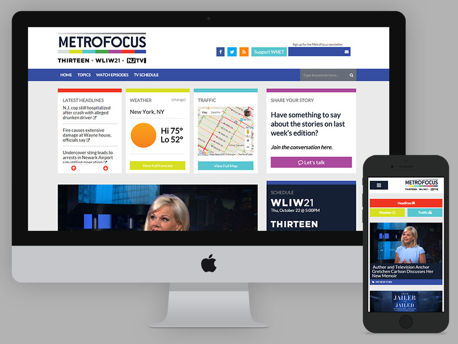
I just finished rebuilding the site for MetroFocus, a multi-platform news program focusing on the New York region. I got to a point where I was happy with the design, with the responsiveness, and we sent the site to our app developer to do some testing. He came back with incredibly insightful feedback when it came to thinking about actually using the site on a mobile device. The header and menu took up too much precious real estate and disappeared from view on scroll. The hamburger was small and surrounded by un-clickable (or, un-touchable) white space.
While the site looked good on a narrow browser, it wasn’t user-friendly for smartphones. I took his notes and spent a long time on my smartphone, clicking through and trying to think beyond “does this look good” and “is it broken” to thinking about the user’s experience on their phone. I can’t be spot on for every device and every situation, but we came to a place that is 100% better across the board.
When thinking about mobile design, there are a million routes to go about to make your site better.
Design for Mobile Attention Spans
Not only does the size of the browser change on mobile devices, but so does the attention span of users. There’s documented proof that people are impatient and will quickly leave your site if it doesn’t load fast enough. If a user is taking the time to come to your site it better load quickly and surface the important information at the top. Lose the fluff and frill that are used on desktop sites to accentuate content. Your content should be strong enough to speak for itself, and should be available immediately.
47% of consumers expect a web page to load in 2 seconds or less.
—Kissmetrics
Both mobile and desktop sites should be purpose-driven, leading users to do what you want and engage with your site. This is particularly important on mobile thanks to our shorter attention spans. This strategy should be reflected in content strategy as well as design. Clear calls to action that are easy to use by touch are imperative. If there are four small buttons next to each other, users may tap the wrong one or skip past it.
Technical Debt Means Slower Connections
Technical Debt is a phrase coined by Ward Cunningham referring to the eventual consequences of any/all design choices. It’s something that happens to every project that carries on through time, particularly those that are adapted to newer technologies while still containing original architecture. When designing a website and thinking desktop-first, your site will come with a lot of unnecessary baggage on mobile.
Every additional resource that needs to be loaded will lead to a longer wait time and possibly a failure to load at all. Every unnecessary script, unnecessary line of CSS, adds to the overall weight of the page. display:none; may hide an image from view but the browser will still continue to load that image, wasting time and resources.

This is an excerpt from a deeply informative infographic from Kissmetrics about loading time and page-abandonment.
If a user isn’t on WiFi while loading your website and it features four videos, three desktop-sized images, and jQuery that you don’t even use on mobile for hover effects, you are costing them. Spare your users and load conditionally. Don’t load bulky files if they won’t be used. It’s so important to parse out those bigger files separately from the core information in order to remove them from the browser load workflow.
Content is King
At the core of your website or mobile app should be content. Design, fancy scripts, etc are just added bonuses to make the experience more palatable on the modern web. But if it takes too long to load those scripts and that keeps the user away from content, then you have failed. The user will leave and may not come back (especially if they regularly cannot access your content).
Let the content shine, because that’s what users are there for. If anything, let this inform your content strategy. Good content should be able to stand on its own.
Testing in Shrunken Browsers is Not Enough
In order to really test a site for mobile users, you must test on actual devices (or, worst case scenario, emulators of those devices). You won’t get a full picture of how your site looks and loads without attempting to do so yourself. Take your phone to an area with minimal signal and see what happens. If your site is taking more than 5 seconds to load, there’s a problem. Put yourself in the place of your users, and ask for others to test on their individual devices.
Take all the feedback you can, learn from it, and build your site to be better.
Additional Resources
- How Loading Time Affects Your Bottom Line by Kissmetrics
- Responsive Design isn’t Good Enough by Ektron
- Responsive Web Design Should Not Be Your Only Mobile Strategy by Smashing Magazine